Links of Dataset & Codes:
For the Record Dataset:
1) Analyse record data set in R studio
Hepatitis C Prediction Dataset is analyzed at here.
This dataset is downloaded from Kaggle. It contains laboratory values of blood donors and Hepatitis C patients and demographic values like age.
The column of Category
is label of this dataset, which tell whether the individual are patients or blood donor. There are 5 categories of labels.
The dataset is cleaned by filling nan values with mean. The column of Sex
are dropped to obtain an all numeric dataset.
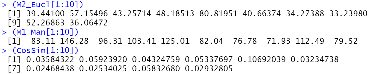
2) Distance Metrics
Three Distance Metrics of Euclidean, Cosine Similarity and Manhattan are used. Euclidean distance is one of the most common metrics for good reasons. Its utility would diminished as the dimensionality increases, though works well with low-dimensional data. The high dimensionality problem of Euclidean distance can be counteracted by cosine similarity, which are widely used in text analysis. Manhattan distance presents higher distance value than Euclidian distance.
3) Determine the number of clusters for record data
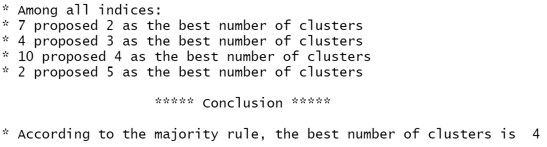
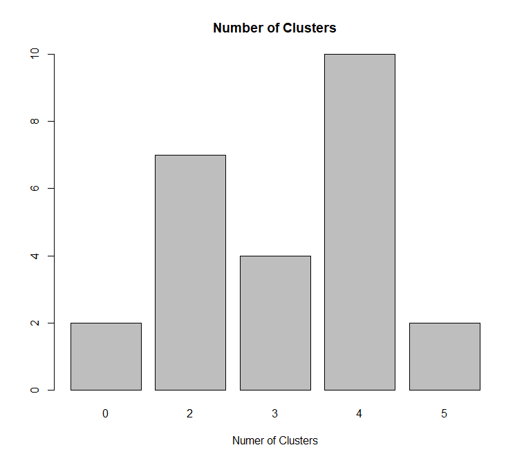
There are several methods are applied to find the best number of clusters.
This is Dindex graphic, which showing that 3 is the best number of clusters in the dataset.
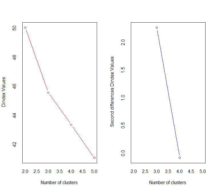
The silhouette graphic show that 2 is the best.

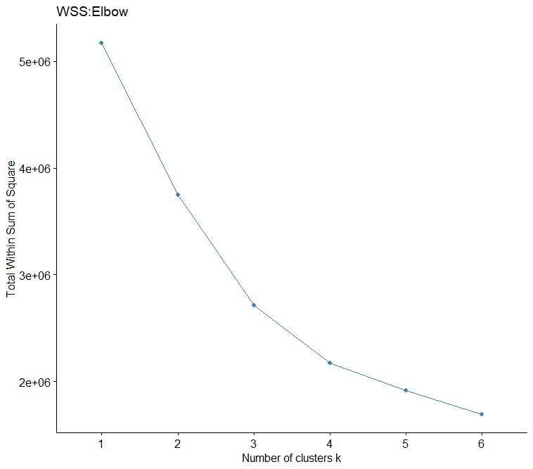
The elbow graphic show that 4 is the best.
The R package NbClust compare lots of indices and conclude that 4 is the best number for clustering this dataset.
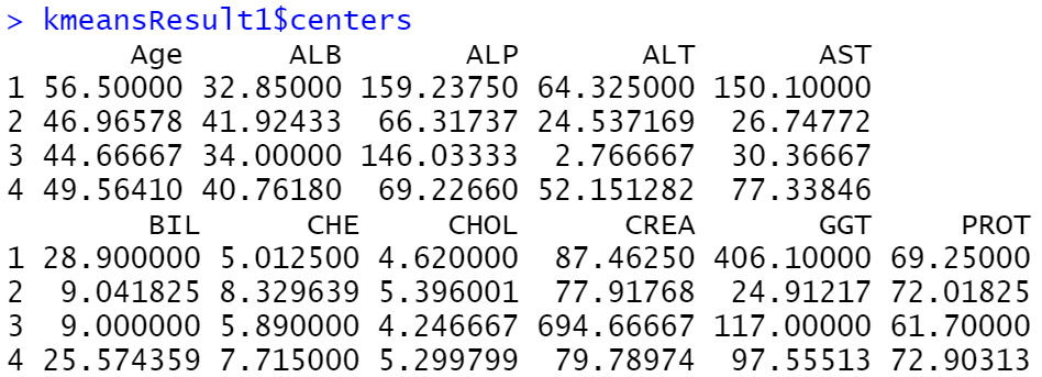
4) Perform k- means
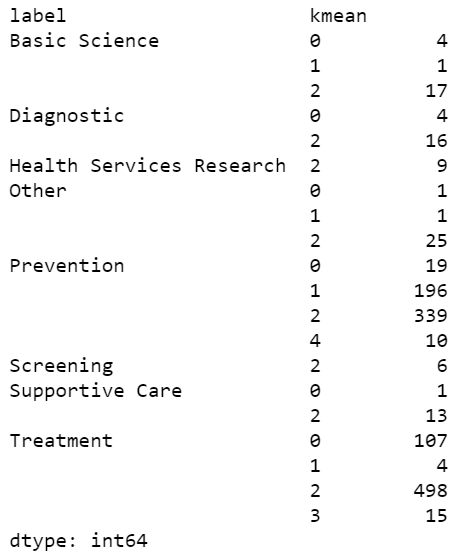
This screenshot shows the size of each k-mean cluster and number of individuals under each real labels.
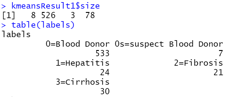
The screenshot below compares k-mean cluster to labels. Look together with the screenshot above, blood donor under real label with size of 533 accounts for large portion of the data, which have a counterpart in k-mean result, 526. This screenshot shows that there are 499 blood donner are clustered together by k-mean. This indicate that the k-mean cluster are able to distinguish the healthy individuals from patients well.
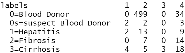
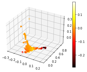
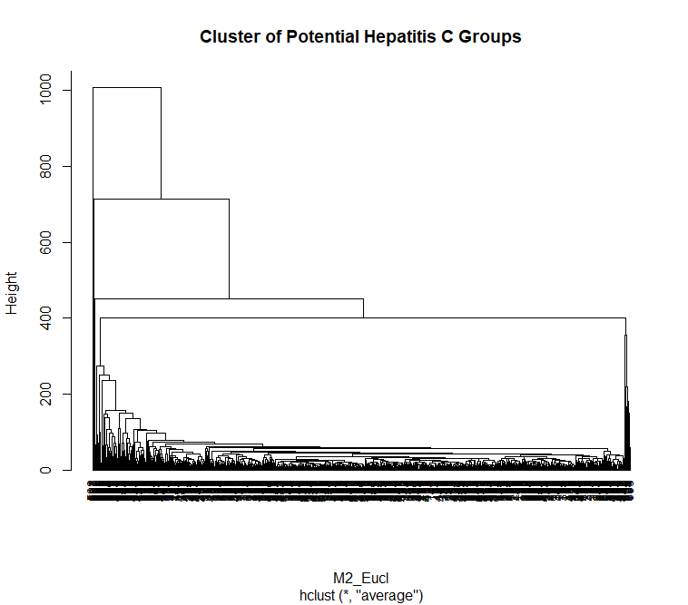
5) Visualizations
Visualization for k-mean-cluster:
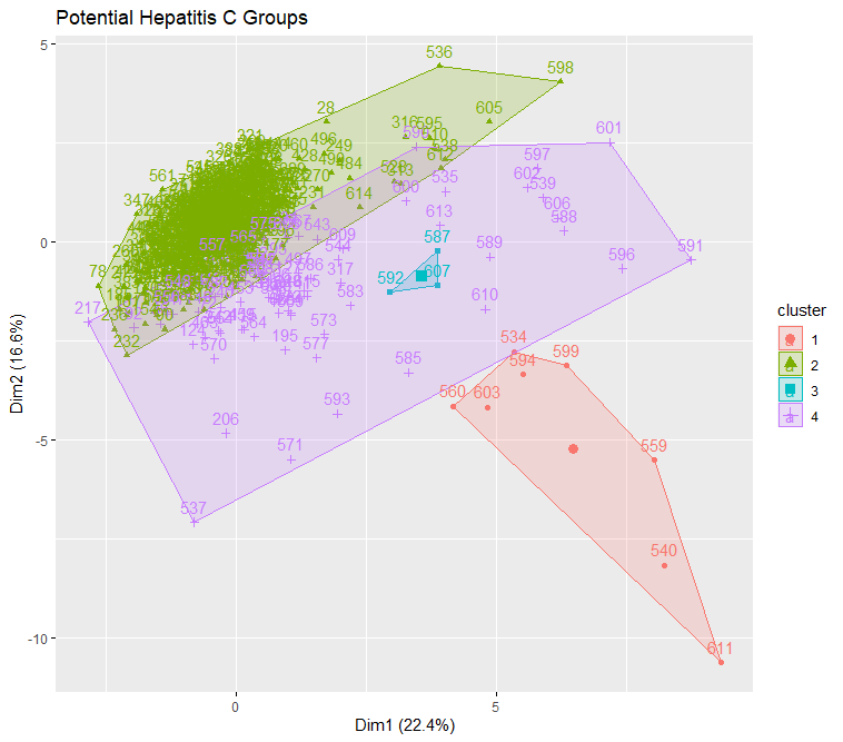
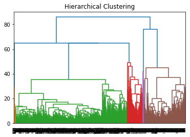
This is a visualization of Hierarchical Clustering. This visualization overlap to each other due to large size of dataset. But it can still see that it has 4 clusters.
For the text dataset:
1) Analyse text dataset in Python
The dataset used here is the part of cleaned version of data which gathered by clinical trial API. BriefSummary
column are selected to create a new text data frame. As the name suggest, it is the provide brief summary for each clinical trial.
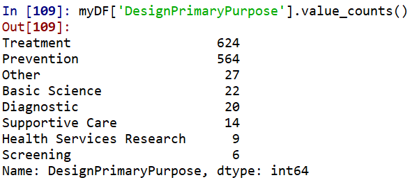
DesignPrimaryPurpose
column is noticed as label for the new dataset, which has 8 categories.
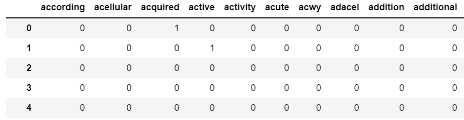
2) Vectorize and prepare dataset using CountVectorizer
Via this function, the text data are vectorized into separated words that without punctuations, numbers, in length greater than 2 and lowercase. 500 maximum features are selected.
3) Transformed text data into a data frame
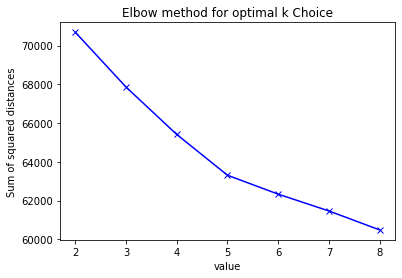
4) Determine the number of clusters
The elbow graphic show that 4 is the best.
The silhouette plot and Calinski Harabasz plot do not show any clear peaks in diagram. The highest point in silhouette is at 2, and the plot has approximate bends at 5-6. Similarly, Calinski Harabasz plot has highest point at 2, and the plot has approximate bends at 5.
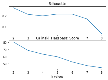
Since the real number of labels is 8, here choose 5 as number of cluster.
5) Conduct k-means clustering
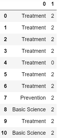
Fig 17 gives an overview of how eight labels are classified in k-mean clusters. Comparing to Fig 13, the size of data in each label, it shows that k-mean cannot predict the labels of data by just text accurately. According to Fig 13, both label Treatment
and label Prevention
have big size of data, 624 and 564, respectively. They are supposed to classified into different clusters by ki-mean method. However, according to Fig 18, both labels have large amount of data that are classified into the same cluster, cluster 2. What is more, these 2 labels are not solely classified into 1 cluster. Apart from 498 of them in cluster 2, 107 number of data labelled as Treatment
are classified in cluster 0. Similarly, apart from 339 of them in cluster 2, 196 number of data labelled as Prevention
are classified in cluster 0.
6) visualization