EDA of United Health Group
To go further, exploration of the components of the stock price time series is necessary.
Basic Time Series Plot
Firstly, it is important to visualize the time series at its most basic level, which is an interactive candlestick plot of daily stock price data over time. When hover over the data on the plot, it tells the information about open price, close price, highest price and the lowest price. Moving the bar at the bottom can select the desired time period.
Show the code
# candlestick plot

#UNH_df <- as.data.frame(tail(UNH, 700))
UNH_df <- as.data.frame(UNH)
UNH_df$Dates <- as.Date(rownames(UNH_df))

fig_UNH <- UNH_df %>% plot_ly(x = ~Dates, type="candlestick",
          open = ~UNH.Open, close = ~UNH.Close,
          high = ~UNH.High, low = ~UNH.Low)
fig_UNH <- fig_UNH %>%
  layout(title = "Basic Candlestick Chart for UnitedHealth Group")

fig_UNH
The plot shows the UNH stock price from 2010 to 2023, and a couple of important observations can be made from the plot. First, there is a clear upward trend in the data, and data is not stationary. This can be confirmed using the plot of the decomposition of the time series plot. The UNH stock price rose slowly until 2016, and then has accelerated. Additionally, there is no seasonality existed within the data, while the series has some cyclic movement since 2018. Finally, this time series appears relatively more multiplicative than additive. It appears to be an exponential increase in amplitudes over time. UnitedHealth Group (UNH) is one of the largest healthcare companies in the world, with a market capitalization of over $450 billion as of April 2023. The company’s stock price is also one of the highest in the healthcare industry.
Lag plot
A lag plot is a type of scatter plot where time series are plotted in pairs against itself some time units behind or ahead, which helps evaluate whether there is randomness or an indication of autocorrelation in the data. Below are sets of lag plots for the UNH stock price data in 12 consecutive days.
Show the code
UNH_ts <- ts(stock_df$UNH, start = c(2010,1),end = c(2023,1),
             frequency = 251)

ts_lags(UNH_ts)
According to the plots, you can see high correlation among consecutive observations. The plot with smaller number of lag shows a more narrow distribution of dots near diagonal, thus, stronger autocorrelation, which indicated the data has stronger autocorrelation with the data closer to observation date. This plot suggests an Auto Regressive model will be more appropriate for future modelling fitting.
Decomposed times series
In order to truly break down the time series data into its core components, decomposition must be run. When decomposing the time series, the four principal components are extracted, including observed data, seasonality, trend, and noise/randomness. The plot below presents the decomposed time series data for UNH stock price. In this plot, the seasonality, trend, and noise are seen. The noise is also known as the remainder in this plot. There is seasonality showing on the decomposed plots, while it is hard to observe from the observed data.
Show the code
decompose_UNH <- decompose(UNH_ts,'multiplicative')
autoplot(decompose_UNH)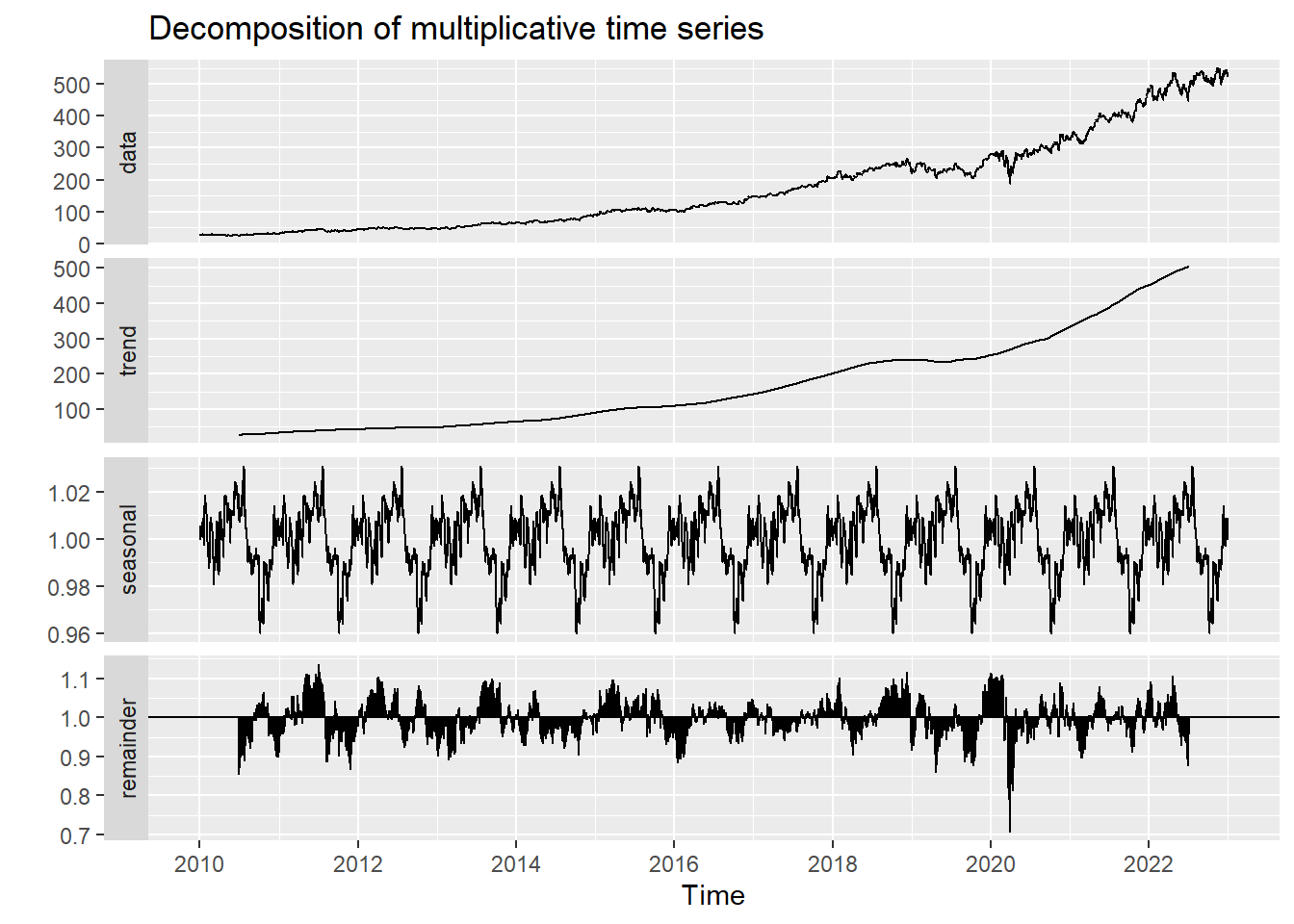
Autocorrelation in Time Series
An essential piece of information when it comes to analyzing time series data is to determine whether a time series is stationary or not. One way to make that determination is by viewing the ACF and PACF plots. The ACF (autocorrelation function) plot is a visualization of correlations between a time series and its lags. In contrast, the PACF (partial autocorrelation function) plot visualizes the partial correlation coefficients and its lags, specifically, it shows correlations of the residuals after removing the effects explained by earlier lags. Below are visualizations of each of the plots described above.
Show the code
UNH_acf <- ggAcf(UNH_ts,100)+ggtitle("UNH ACF Plot")

UNH_pacf <- ggPacf(UNH_ts)+ggtitle("PACF Plot for UHNs")
grid.arrange(UNH_acf, UNH_pacf,nrow=2)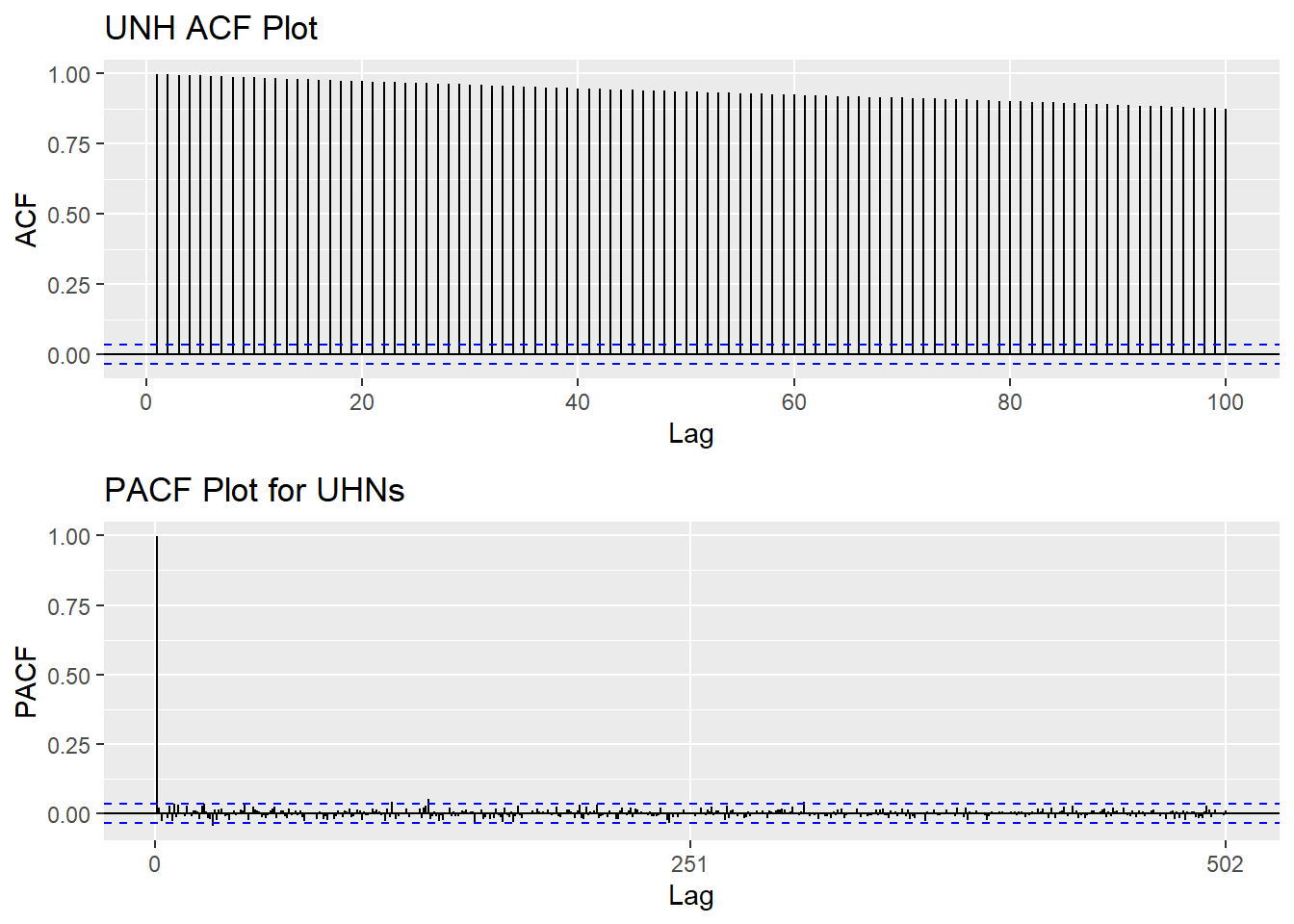
The ACF plots indicates strong positive correlation among time series data, thus, the series is not stationary. The PACF plot doesn’t show any significant value.
Augmented Dickey-Fuller Test
Show the code
################ ADF Test #############
tseries::adf.test(UNH_ts)
    Augmented Dickey-Fuller Test

data:  UNH_ts
Dickey-Fuller = -1.0864, Lag order = 14, p-value = 0.9248
alternative hypothesis: stationary
Apart from observing both ACF and PACF plots, Augmented Dickey-Fuller Test can also be applied to check the stationarity. The null hypothesis is: Data has unit roots; hence the series is not stationary. The result of this test has significant value 0.9248, which is much larger than the 0.05 significant value. Hence, here doesn’t have enough evidence to reject null hypothesis, and it confirms with plots that the series is non-stationary.
Detrending & Differencing
In general, it is necessary for time series data to be stationary. Detrending and differencing are two methods that play down the effects of non-stationary so the stationary properties of the series.
Show the code
fit = lm(UNH_ts~time(UNH_ts), na.action=NULL)

y= UNH_ts
x=time(UNH_ts)
DD<-data.frame(x,y)
ggp <- ggplot(DD, aes(x, y)) +
  geom_line()

ggp <- ggp +
  stat_smooth(method = "lm",
              formula = y ~ x,
              geom = "smooth") +ggtitle("UNH Stock Price")+ylab("Price")

plot1<-ggAcf(resid(fit),30, main="ACF Plot for Detrended Data")
plot2<-ggAcf(diff(UNH_ts),30, main="ACF Plot for First Differenced Data")
plot3<-ggAcf(diff(log(UNH_ts)),30, main="ACF Plot for Log Transformed First differenced Data")


grid.arrange(ggp, plot1, plot2,plot3,nrow=4)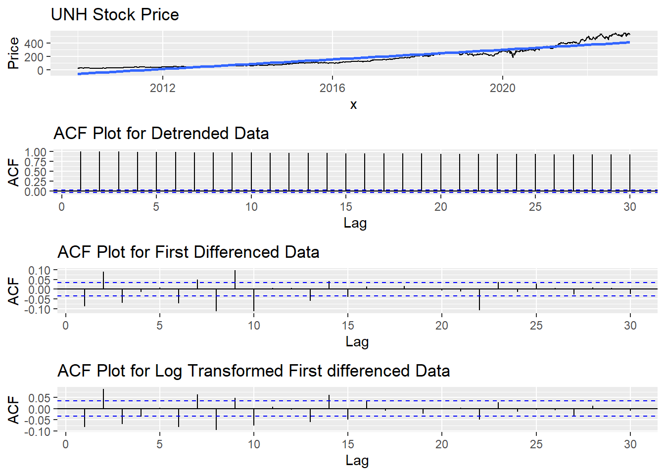
The graphs above shows the procedures of converting stationary data series into non-stationary. The ACF plot for log transformed first differenced data series are closest to stationary.
Show the code
tseries::adf.test(diff(log(UNH_ts)))Warning in tseries::adf.test(diff(log(UNH_ts))): p-value smaller than printed
p-value
    Augmented Dickey-Fuller Test

data:  diff(log(UNH_ts))
Dickey-Fuller = -16.952, Lag order = 14, p-value = 0.01
alternative hypothesis: stationary
Moving Average Smoothing
Smoothing methods are a family of forecasting methods that average values over multiple periods in order to reduce the noise and uncover patterns in the data. It is useful as a data preparation technique as it can reduce the random variation in the observations and better expose the structure of the underlying causal processes. We call this an m-MA, meaning a moving average of order m.
Show the code
MA_7 <- autoplot(UNH_ts, series="Data") +
        autolayer(ma(UNH_ts,7), series="7-MA") +
        xlab("Year") + ylab("Adjusted Closing Price") +
        ggtitle("UNH Stock Price Trend in (7-days Moving Average)") +
        scale_colour_manual(values=c("UNH_ts"="grey50","7-MA"="red"),
                            breaks=c("UNH_ts","7-MA"))

MA_30 <- autoplot(UNH_ts, series="Data") +
        autolayer(ma(UNH_ts,30), series="30-MA") +
        xlab("Year") + ylab("Adjusted Closing Price") +
        ggtitle("UNH Stock Price Trend in (30-days Moving Average)") +
        scale_colour_manual(values=c("UNH_ts"="grey50","30-MA"="red"),
                            breaks=c("UNH_ts","30-MA"))

MA_251 <- autoplot(UNH_ts, series="Data") +
        autolayer(ma(UNH_ts,251), series="251-MA") +
        xlab("Year") + ylab("Adjusted Closing Price") +
        ggtitle("UNH Stock Price Trend in (251-days Moving Average)") +
        scale_colour_manual(values=c("UNH_ts"="grey50","251-MA"="red"),
                            breaks=c("UNH_ts","251-MA"))

grid.arrange(MA_7, MA_30, MA_251, ncol=1)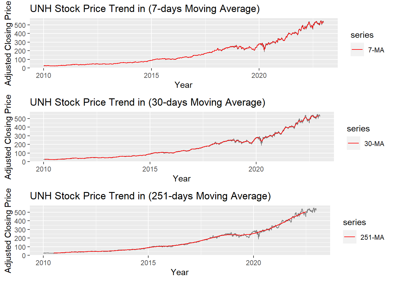
The graph above shows the moving average of 7 days, 30 days and 251 days. 251 days was choose because there are around 251 days of stock price data per year. According to the plots, it can be observed that When MA is very large(MA=251), some parts of smoothing line(red) do not fit the real stock price line. While When MA is small(MA=7), the smoothing line(red) fits the real price line. MA-30 greatly fits the real price line. Therefore, MA-30 might be a good parameter for smoothing.