EDA of AstraZeneca
Refer to EDA-AZN for more detailed description for each plot.
Basic Time Series Plot
Firstly, it is important to visualize the time series at its most basic level, which is an interactive candlestick plot of daily stock price data over time. When hover over the data on the plot, it tells the information about open price, close price, highest price and the lowest price. Moving the bar at the bottom can select the desired time period.
Show the code
# candlestick plot

AZN_df <- as.data.frame(AZN)
AZN_df$Dates <- as.Date(rownames(AZN_df))

fig_AZN <- AZN_df %>% plot_ly(x = ~Dates, type="candlestick",
          open = ~AZN.Open, close = ~AZN.Close,
          high = ~AZN.High, low = ~AZN.Low)
fig_AZN <- fig_AZN %>%
  layout(title = "Basic Candlestick Chart for AstraZeneca")

fig_AZN
Lag plot
A lag plot is a type of scatter plot where time series are plotted in pairs against itself some time units behind or ahead, which helps evaluate whether there is randomness or an indication of autocorrelation in the data. Below are sets of lag plots for the UNH stock price data in 12 consecutive days.
Show the code
AZN_ts <- ts(stock_df$AZN, start = c(2010,1), end = c(2023,1),
             frequency = 251)

ts_lags(AZN_ts)
According to the plots, you can see high correlation among consecutive observations. The plot with smaller number of lag shows a more narrow distribution of dots near diagonal, thus, stronger autocorrelation, which indicated the data has stronger autocorrelation with the data closer to observation date. This plot suggests an Auto Regressive model will be more appropriate for future modelling fitting.
Decomposed times series
Show the code
decompose_AZN <- decompose(AZN_ts,'multiplicative')
autoplot(decompose_AZN)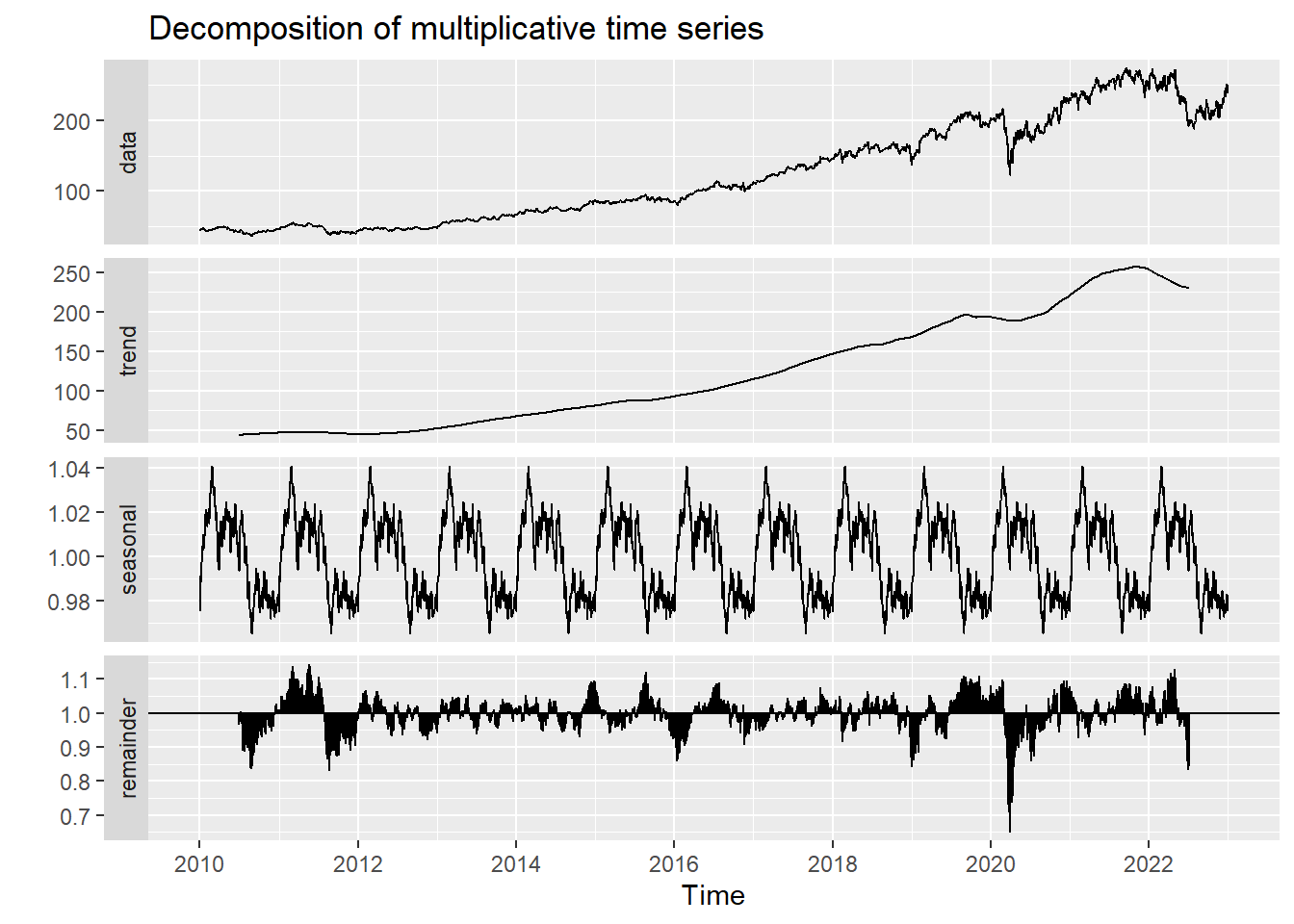
Autocorrelation in Time Series
Show the code
AZN_acf <- ggAcf(AZN_ts,100)+ggtitle("ACF Plot for AZN")
AZN_pacf <- ggPacf(AZN_ts,100)+ggtitle("PACF Plot for AZN")

grid.arrange(AZN_acf, AZN_pacf,nrow=2)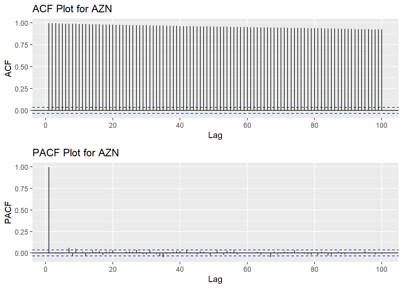
Augmented Dickey-Fuller Test
Show the code
tseries::adf.test(AZN_ts)
    Augmented Dickey-Fuller Test

data:  AZN_ts
Dickey-Fuller = -3.3602, Lag order = 14, p-value = 0.06026
alternative hypothesis: stationary
Moving Average Smoothing
Smoothing methods are a family of forecasting methods that average values over multiple periods in order to reduce the noise and uncover patterns in the data. It is useful as a data preparation technique as it can reduce the random variation in the observations and better expose the structure of the underlying causal processes. We call this an m-MA, meaning a moving average of order m.
Show the code
MA_7 <- autoplot(AZN_ts, series="Data") +
        autolayer(ma(AZN_ts,7), series="7-MA") +
        xlab("Year") + ylab("Adjusted Closing Price") +
        ggtitle("AZN Stock Price Trend in (7-days Moving Average)") +
        scale_colour_manual(values=c("AZN_ts"="grey50","7-MA"="red"),
                            breaks=c("AZN_ts","7-MA"))

MA_30 <- autoplot(AZN_ts, series="Data") +
        autolayer(ma(AZN_ts,30), series="30-MA") +
        xlab("Year") + ylab("Adjusted Closing Price") +
        ggtitle("AZN Stock Price Trend in (30-days Moving Average)") +
        scale_colour_manual(values=c("AZN_ts"="grey50","30-MA"="red"),
                            breaks=c("AZN_ts","30-MA"))

MA_251 <- autoplot(AZN_ts, series="Data") +
        autolayer(ma(AZN_ts,251), series="251-MA") +
        xlab("Year") + ylab("Adjusted Closing Price") +
        ggtitle("AZN Stock Price Trend in (251-days Moving Average)") +
        scale_colour_manual(values=c("AZN_ts"="grey50","251-MA"="red"),
                            breaks=c("AZN_ts","251-MA"))

grid.arrange(MA_7, MA_30, MA_251, ncol=1)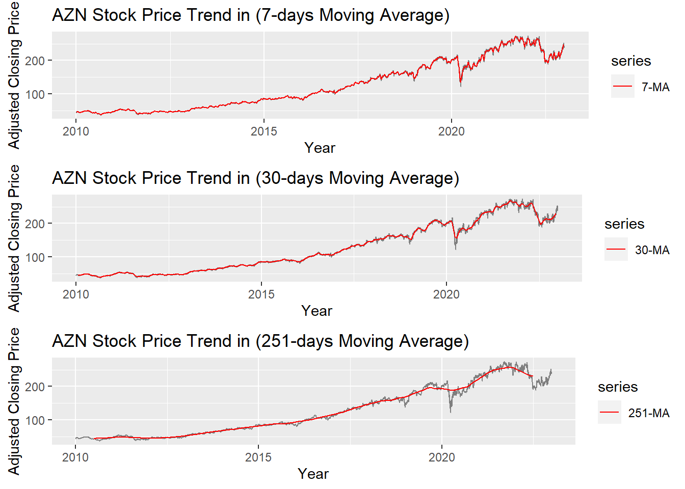
The graph above shows the moving average of 7 days, 30 days and 251 days. 251 days was choose because there are around 251 days of stock price data per year. According to the plots, it can be observed that When MA is very large(MA=251), some parts of smoothing line(red) do not fit the real stock price line. While When MA is small(MA=7), the smoothing line(red) fits the real price line. MA-30 greatly fits the real price line. Therefore, MA-30 might be a good parameter for smoothing.