EDA of SYK
Refer to EDA-UNH for more detailed description for each plot.
Basic Time Series Plot
Show the code
# candlestick plot

SYK_df <- as.data.frame(SYK)
SYK_df$Dates <- as.Date(rownames(SYK_df))

fig_SYK <- SYK_df %>% plot_ly(x = ~Dates, type="candlestick",
          open = ~SYK.Open, close = ~SYK.Close,
          high = ~SYK.High, low = ~SYK.Low)
fig_SYK <- fig_SYK %>%
  layout(title = "Basic Candlestick Chart for Pfizer")

fig_SYK
Lag plot
Show the code
SYK_ts <- ts(stock_df$SYK, start = c(2010,1),end = c(2023,1),
             frequency = 251)
ts_lags(SYK_ts)
Decomposed times series
Show the code
decompose_SYK <- decompose(SYK_ts,'additive')
autoplot(decompose_SYK)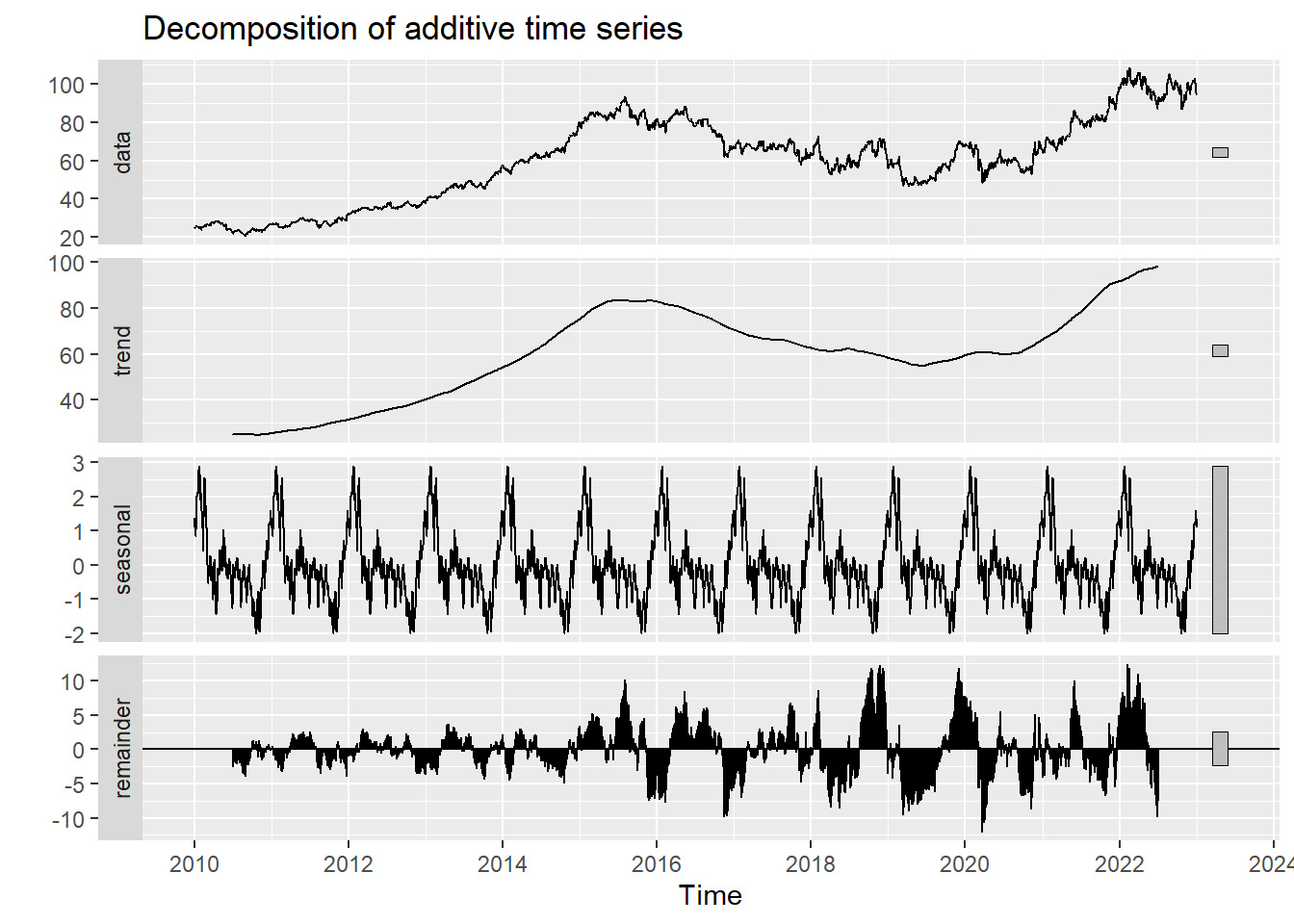
Autocorrelation in Time Series
Show the code
ggAcf(SYK_ts,100)+ggtitle("ACF Plot for SYK")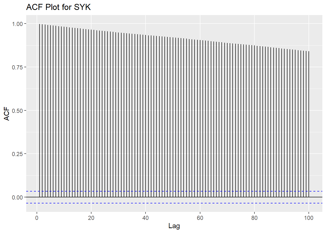
Show the code
ggPacf(SYK_ts)+ggtitle("PACF Plot for SYK")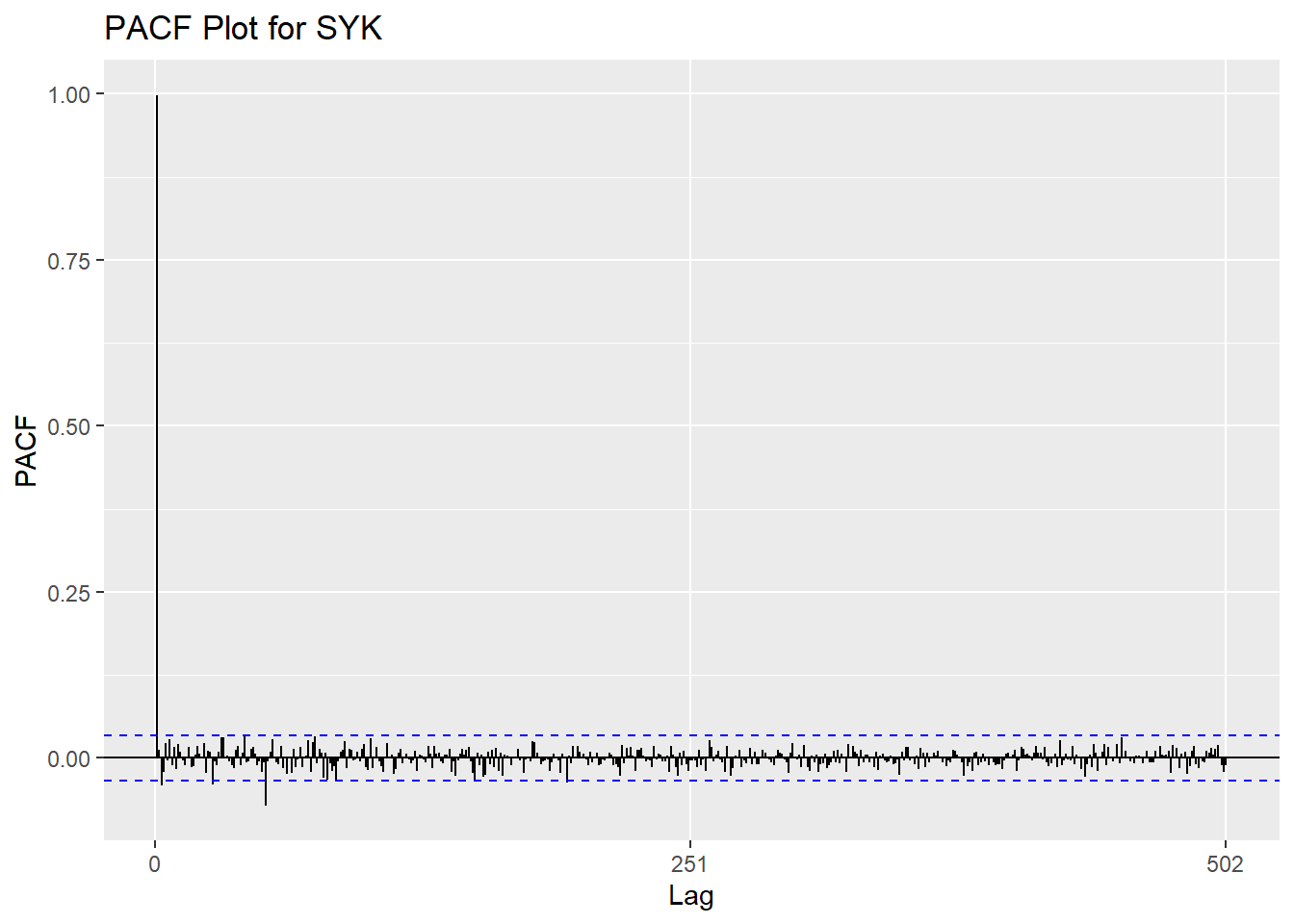
Augmented Dickey-Fuller Test
Show the code
tseries::adf.test(SYK_ts)
    Augmented Dickey-Fuller Test

data:  SYK_ts
Dickey-Fuller = -1.734, Lag order = 14, p-value = 0.6909
alternative hypothesis: stationary
Detrending
Show the code
fit = lm(SYK_ts~time(SYK_ts), na.action=NULL)

y= SYK_ts
x=time(SYK_ts)
DD<-data.frame(x,y)
ggp <- ggplot(DD, aes(x, y)) +
  geom_line()

ggp <- ggp +
  stat_smooth(method = "lm",
              formula = y ~ x,
              geom = "smooth") +ggtitle("SYK Stock Price")+ylab("Price")

plot1<-autoplot(resid(fit), main="detrended")
plot2<-autoplot(diff(SYK_ts), main="first difference")


grid.arrange(ggp, plot1, plot2,nrow=3)
Don't know how to automatically pick scale for object of type <ts>. Defaulting
to continuous.
Don't know how to automatically pick scale for object of type <ts>. Defaulting
to continuous.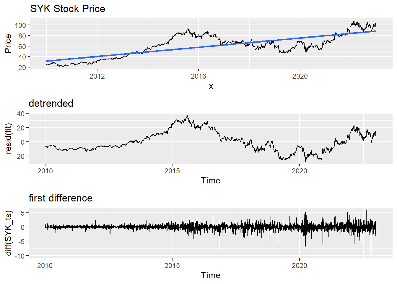
Moving Average Smoothing
Smoothing methods are a family of forecasting methods that average values over multiple periods in order to reduce the noise and uncover patterns in the data. It is useful as a data preparation technique as it can reduce the random variation in the observations and better expose the structure of the underlying causal processes. We call this an m-MA, meaning a moving average of order m.
Show the code
MA_7 <- autoplot(SYK_ts, series="Data") +
        autolayer(ma(SYK_ts,7), series="7-MA") +
        xlab("Year") + ylab("Adjusted Closing Price") +
        ggtitle("SYK Stock Price Trend in (7-days Moving Average)") +
        scale_colour_manual(values=c("SYK_ts"="grey50","7-MA"="red"),
                            breaks=c("SYK_ts","7-MA"))

MA_30 <- autoplot(SYK_ts, series="Data") +
        autolayer(ma(SYK_ts,30), series="30-MA") +
        xlab("Year") + ylab("Adjusted Closing Price") +
        ggtitle("SYK Stock Price Trend in (30-days Moving Average)") +
        scale_colour_manual(values=c("SYK_ts"="grey50","30-MA"="red"),
                            breaks=c("SYK_ts","30-MA"))

MA_251 <- autoplot(SYK_ts, series="Data") +
        autolayer(ma(SYK_ts,251), series="251-MA") +
        xlab("Year") + ylab("Adjusted Closing Price") +
        ggtitle("SYK Stock Price Trend in (251-days Moving Average)") +
        scale_colour_manual(values=c("SYK_ts"="grey50","251-MA"="red"),
                            breaks=c("SYK_ts","251-MA"))

grid.arrange(MA_7, MA_30, MA_251, ncol=1)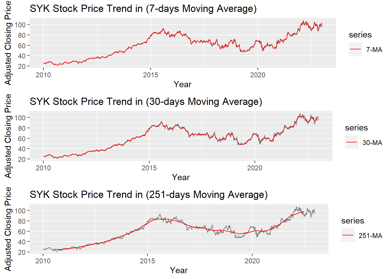
The graph above shows the moving average of 7 days, 30 days and 251 days. 251 days was choose because there are around 251 days of stock price data per year. According to the plots, it can be observed that When MA is very large(MA=251), some parts of smoothing line(red) do not fit the real stock price line. While When MA is small(MA=7), the smoothing line(red) fits the real price line. MA-30 greatly fits the real price line. Therefore, MA-30 might be a good parameter for smoothing.