ARIMA for Pre-COVID UNH
Step 1: Determine the stationality of time series
Based on information obtained from both ACF graphs and Augmented Dickey-Fuller Test, the time series data is non-stationary.
Show the code
UNH_acf <- ggAcf(UNH_ts,100)+ggtitle("UNH ACF Plot")

UNH_pacf <- ggPacf(UNH_ts)+ggtitle("PACF Plot for UHNs")
grid.arrange(UNH_acf, UNH_pacf,nrow=2)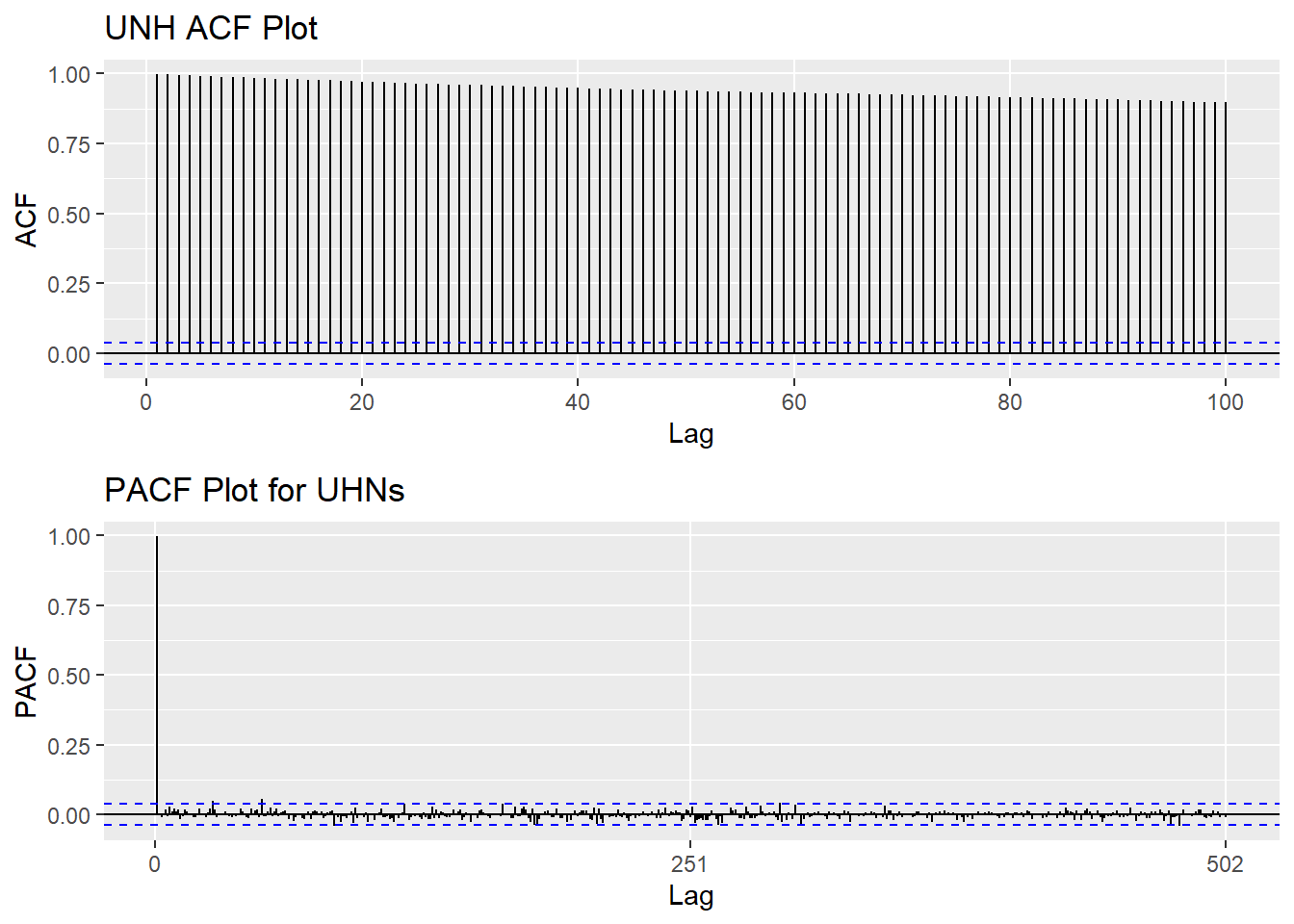
Show the code
tseries::adf.test(UNH_ts)
    Augmented Dickey-Fuller Test

data:  UNH_ts
Dickey-Fuller = -1.5332, Lag order = 13, p-value = 0.776
alternative hypothesis: stationary
Step 2: Eliminate Non-Stationality
Since this data is non-stationary, it is important to necessary to convert it to stationary time series. This step employs a series of actions to eliminate non-stationality, i.e. log transformation and differencing the data. It turns out the log transformed and 1st differened data has shown good stationary property, there are no need to go further at 2nd differencing. What is more, the Augmented Dickey-Fuller Test also confirmed that the log transformed and 1st differenced data is stationary. Therefore, the log transformation and 1st differencing would be the actions taken to eliminate the non-stationality.
Show the code
plot1<- ggAcf(log(UNH_ts) %>%diff(), 50, main="ACF Plot for Log Transformed & 1st differenced Data")
plot2<- ggAcf(log(UNH_ts) %>%diff()%>%diff(),50, main="ACF Plot for Log Transformed & 2nd differenced Data")

grid.arrange(plot1, plot2,nrow=2)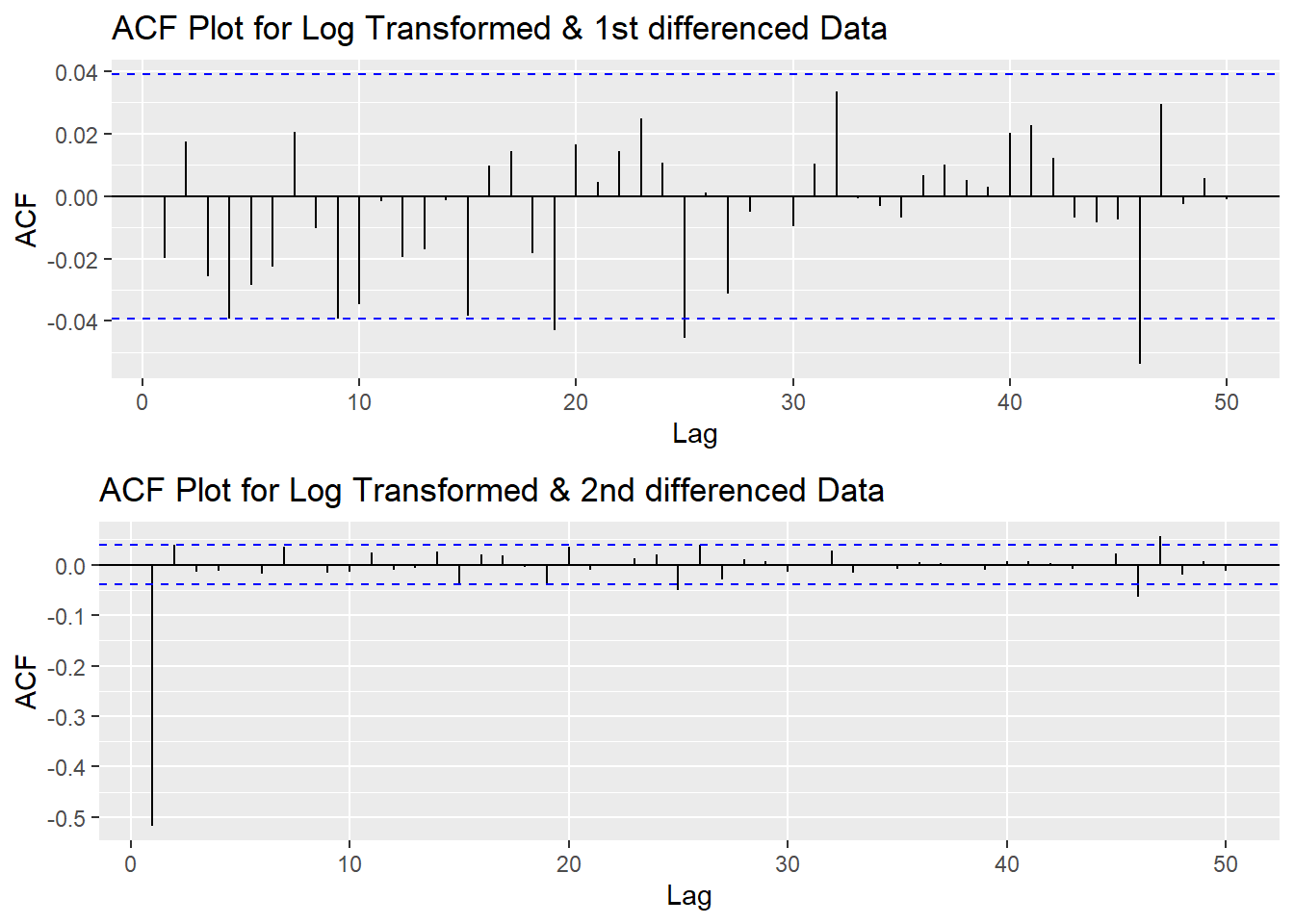
Show the code
tseries::adf.test(log(UNH_ts) %>%diff())
    Augmented Dickey-Fuller Test

data:  log(UNH_ts) %>% diff()
Dickey-Fuller = -15.171, Lag order = 13, p-value = 0.01
alternative hypothesis: stationary
Step 3: Determine p,d,q Parameters
Show the code
plot3<- ggPacf(log(UNH_ts) %>%diff(),50, main="PACF Plot for Log Transformed & 1st differenced Data")

grid.arrange(plot1,plot3)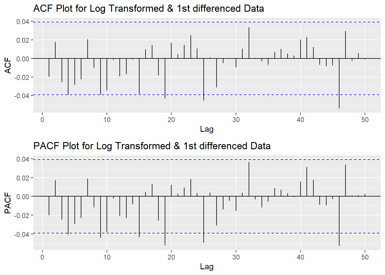
According to the PACF plot and ACF plot above, no obivious peaks in neither ACF nor PACF, so both p and q will be 0. Since I only differenced the data once, the d would be 1.
Step 4: Fit ARIMA(p,d,q) model
Show the code
fit1 <- Arima(log(UNH_ts), order=c(0, 1, 0),include.drift = TRUE)
summary(fit1)
Series: log(UNH_ts)
ARIMA(0,1,0) with drift
Coefficients:
drift
1e-03
s.e. 3e-04
sigma^2 = 0.0002069: log likelihood = 7085.52
AIC=-14167.03 AICc=-14167.03 BIC=-14155.37
Training set error measures:
ME RMSE MAE MPE MAPE
Training set 1.295476e-06 0.0143782 0.01042779 -0.0005696724 0.2442792
MASE ACF1
Training set 0.04232194 -0.01978998Model Diagnostics
- Inspection of the time plot of the standardized residuals below shows no obvious patterns.
- Notice that there may be outliers, with a few values exceeding 3 standard deviations in magnitude.
- The ACF of the standardized residuals shows no apparent departure from the model assumptions, no significant lags shown.
- The normal Q-Q plot of the residuals shows that the assumption of normality is reasonable, with the exception of the fat-tailed.
- The model appears to fit well.
Show the code
model_output <- capture.output(sarima(log(UNH_ts), 0,1,0))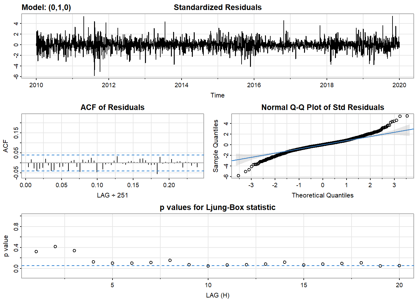
Show the code
cat(model_output[8:38], model_output[length(model_output)], sep = "\n") #to get rid of the convergence status and details of the optimization algorithm used by the sarima() converged
$fit
Call:
arima(x = xdata, order = c(p, d, q), seasonal = list(order = c(P, D, Q), period = S),
xreg = constant, transform.pars = trans, fixed = fixed, optim.control = list(trace = trc,
REPORT = 1, reltol = tol))
Coefficients:
constant
1e-03
s.e. 3e-04
sigma^2 estimated as 0.0002068: log likelihood = 7085.52, aic = -14167.03
$degrees_of_freedom
[1] 2509
$ttable
Estimate SE t.value p.value
constant 0.001 3e-04 3.3048 0.001
$AIC
[1] -5.644235
$AICc
[1] -5.644234
$BIC
[1] -5.639591Compare with auto.arima() function
Both auto.arima and manually fitted model suggested ARIMA(0,1,0) is the best fit model.
Show the code
auto.arima(log(UNH_ts))Series: log(UNH_ts)
ARIMA(0,1,0) with drift
Coefficients:
drift
1e-03
s.e. 3e-04
sigma^2 = 0.0002069: log likelihood = 7085.52
AIC=-14167.03 AICc=-14167.03 BIC=-14155.37Step 5: Forecast
The blue part in graph below forecast the next 100 values of UNH stock price in 80% and 95% confidence level.
Show the code
(UNH_ts) %>%
  Arima(order=c(0,1,0),include.drift = TRUE) %>%
  forecast(300) %>%
  autoplot() +
  ylab("UNH stock prices prediction") + xlab("Year")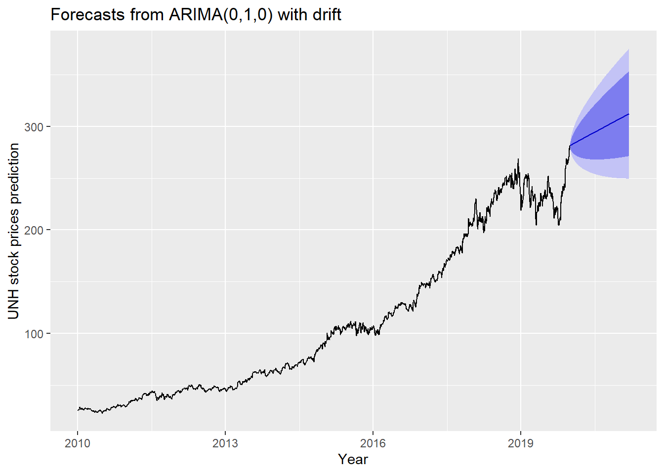
Show the code
precovid_pred <- as.data.frame((UNH_ts) %>%
  Arima(order=c(0,1,0),include.drift = TRUE) %>%
  forecast(768))['Point Forecast']

unh_postcovid <- filter(unh,Dates>"2020-01-9")
unh_postcovid$preds <- precovid_pred$`Point Forecast`
True UNH Stock Price VS UHN ARIMA Prediction since COVID 19
The plot below shows the forecast of pre-COVID only UNH stock price during the COVID period and the real-world UNH stock price. According to the plot, the real world UNH stock price illustrate a more upward trend then the prediction. This indicates that as the pandemic continued and the demand for healthcare services increased, UNH stocks rebounded.
Show the code
g1<- ggplot(unh_postcovid, aes(x=Dates)) +
  geom_line(aes(y=UNH, colour="True value"))+
  geom_line(aes(y=preds, colour="Prediction"))+
   labs(
    title = "True UNH Stock Price VS UHN ARIMA Prediction since COVID 19",
    x = "Date",
    y = "Adjusted Closing Prices")+
    guides(colour=guide_legend(title="Healthcare Companies"))


ggplotly(g1) %>% layout(hovermode = "x")